Logo
While trying to get my comic to be on Comixology Submit, I was required to create my own publishing name and include a logo. I was always under the impression that Comixology Submit was for self-publishers, so I thought it was odd that I required a publisher name. I was originally going to just use any random picture and use my name, but instead I figured I'd take the opportunity to make myself look a bit more professional.
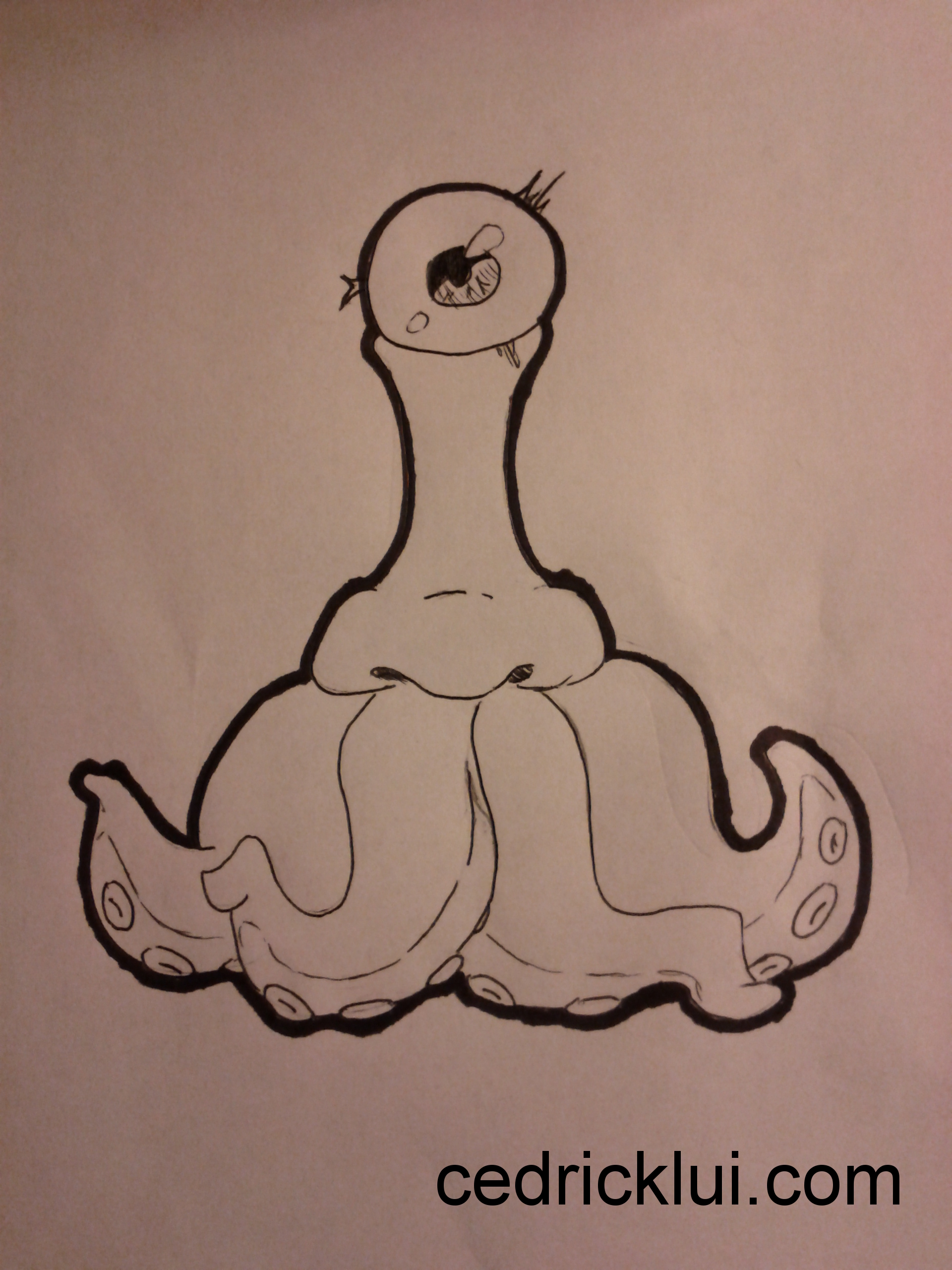
I originally came up with this weird guy while bored at work. It kind of just spilled from my brain and I really liked the look of him (as opposed to a lot of weird stuff I randomly doodle). I found myself drawing it over and over in different variations. Sometimes there'd be a scarf, other times I'd draw some tattoos on the tentacles. When it came time to do the logo, I figured I'd somehow make this weird thing my logo.
I started with a quick and crude drawing I did, which I then had to figure out how to get digitized. I took a picture of the drawing, and threw it onto GIMP (the poor man's photoshop). I then coloured over the drawing and marked out where some of the negative spaces would go. Finally I googled how to make clean lines and found out about the path tool.
In the end, I actually like how it turned out. I've had quite a few comments on how phallic it looks, but I feel that my most recent version helps alleviate the resemblance. Check the gallery below to see some of the process.


